“Meg Hitchcock: In the Beginning, There was the Word” by Kim Power
July 15, 2019
“We live for books. A sweet mission in this world dominated by disorder and decay.”
― Umberto Eco, The Name of the Rose
In today’s era of immediate gratification and hi-speed internet, where the word has become tantamount to extinction, shortened to the barest of acronyms and further replaced by emojis and gifs, paper collage artist Meg Hitchcock is a savior, or at the very least an advocate for the lost art of literary reference and reverence. The creation, deconstruction and resurrection of the word through Hitchcock’s analogue process of typing, cutting out and pasting, in what some would call an obsessive (others devoted) methodology verges on madness.
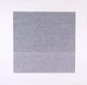
Meg Hitchcock Nocturne 2019, typed words, acrylic paint, 36” x 36”.
Yet it is that very act that defines the sanity of her choices. Brought up in a strictly evangelical household and followed that path to its ultimate conclusion, a break from the flock. Hitchcock’s emancipation was no sudden act of rebellion, but a slow awakening into a full-blown awareness that, for her, there was something beyond the walls of a puritanical belief system that held her prisoner in its dogma and singular vision of reality. Those walls came down not by tumbling but brick by brick through her own personal work towards self-actualization, enlightenment and finally, a commitment not to her church, but to her own truth. Today, Hitchcock identifies as an atheist and a humanist. After years of searching for God in numerous iterations invented by man from Christianity to Eastern religions, she has come to a singular ideology that grounds and sustains her, stating, “I find it to be deeply comforting to exchange my belief in God for a trust in humanity.”
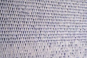
Meg Hitchcock Nocturne (detail) 2019, typed words, acrylic paint, 36” x 36”.
What relevance does Hitchcock’s belief system have for her artwork? It is everything, or at least the original impetus of a larger and evolving creative vision. In the beginning, there was the word, or words. A graduate of the San Francisco Art Institute (1996), Hitchcock initially began as an abstract painter. However, following her move to New York City in 2007, she quickly realized that, though she found painting satisfying, she needed to find a visual language that was closer to her personal experience. Having a wide collection of spiritual texts that she had collected over the years, books that had been prohibited during her upbringing as they were thought to contain the voice of the devil, Hitchcock began the process of deconstruction. She cut the letters out of her own and used books, experimenting with arranging them in different configurations, with consideration for design and structure but also adding a touch of whimsy and just like that, her faith or rather understanding of what was her developing belief system, merged into her art practice and they became one. It was a revelation.
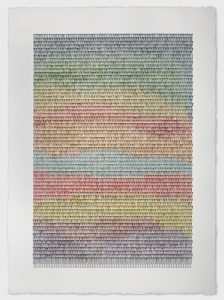
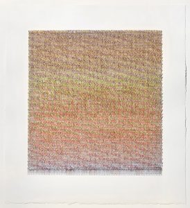
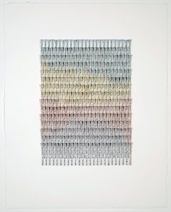
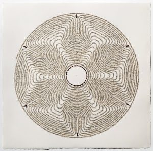
Meg Hitchcock Hortus Deliciarum (Garden of Delights) 2019, typed words, acrylic paint, 42” x 30”.
From that moment of profound discovery, Hitchcock has blossomed into an artist whose now mature practice has gained much recognition. Her artworks have been included in seven distinguished collections, including that of the Yale Collection of American Literature, Beinecke Library, Yale University, Nouf Al-Saud of the Royal Family of Saudi Arabia, and the Crystal Bridges Museum, Bentonville, AR. Thus far she has had eight solo shows in New York City alone, including her most recent exhibition this spring, Cathedral, at Margaret Thatcher Projects in the Chelsea Art District and has been included in numerous group exhibitions from the East to the West Coast of the United States and abroad in Australia, France, England, and Italy, most notably the Crystal Bridges Museum in Bentonville, AR (State of the Art: Discovering American Art Now, 2014), the San Jose Institute of Contemporary Art (This Is Not A Book 2016), and the Currier Museum of Art, Manchester, NH (Deep Cuts: Contemporary Paper Cutting, 2017).
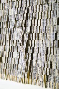
Meg Hitchcock Cathedral 2018, typed words on Bible margins, 42” x 23.5”.
Hitchcock’s older style reanimated and transformed one sacred text into another (of an opposite faction) through a meticulous process of dissection and reconfiguration, exploring multiple variations—from arranging letters and words in snake-like coils, stacking them on top of one another and layering them in overlapping rows to name a few—forming abstract, organic and at times recognizable shapes and designs. Hitchcock’s compositions depend on a combination of intuition and practical consideration of spatial distribution, layout and dimension. The individual letters (described by Hitchcock as “chads”) were cut out using the fine tip of an expertly wielded X-acto blade. No perforations or ragged edges distract or deter. Yet, their lack of uniformity, despite their hard edges—both in the extraction and application—indicate the direct involvement of the human hand. Each letter is carefully applied with a specially concocted wheat paste based recipe developed by Hitchcock for this purpose. Akin to typesetting, in which metal molded letters are arranged individually on a rack for printing, Hitchcock’s collages require even more tireless concentration and precise effort, a task often tedious and time-consuming yet endlessly rewarding in its final realization.
Meg Hitchcock Cathedral (detail) 2018, typed words on Bible margins, 42” x 23.5”.
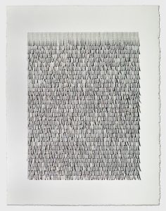
Hitchcock’s collages harken back to the “concrete poems” of the early 1950s, a term coined by Max Bill, founder of the Concrete Art Movement, and Öyving Fahlström, author of the Manifesto for Concrete Poetry (1952-1955). Fahlström championed the idea that poetry could be not only an expression in word but also concrete form. He hypothesized that “In the case of poetry strophes can be broken up into vertical parallelisms in such a way that content determines form by placing the word exactly below the word above it, which it repeats, or vice versa so that when you have a fragment of line vertically parallel with the one above, it brings with it the content of the line above.” This is particularly relevant in view of Hitchcock’s more recent works at Margaret Thatcher Projects in the Chelsea Arts District of NYC. Hitchcock arranges strips of paper, pasting them vertically in repetitive rows—each strip overlapping the previous one in a dimensional, almost woven, pattern. Individually typed tabs connect in consecutive order to their original source in a successive flow of thought. This fluid format exists within the more formal structure of square or rectangular shapes into which the words are arranged. As an added element of interest, these strips are curled or bent outwards towards the viewer, as in her collage Mantra 01 (Ganesh Mantra) or the Mantra 02 (Crown Mantra), giving a visually tactile feel to the surface akin to Scandinavian rya rugs, sans knotting, each tab measuring no longer than the word it represents.
Meg Hitchcock Vanity, Vanity 2018, typed words, acrylic paint, 30.25” x 27.25”.
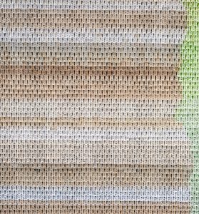
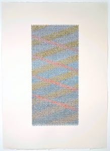
In contrast to the verticality of the words themselves, the colors of these newer works appear as horizontal striations without solid borders, especially evident in the rainbow colors of Hortus Deliciarum (Garden of Delights), but also as deliberate patterning (seen in Than, 2019). Each collage reflects Hitchcock’s on-again, off-again relationship with deliberate control versus free-form random patterning. Created with a thin wash of acrylic paint onto “50# paper from an acid-free sketch pad,” Hitchcock “types the words on the white side, and often soaks it in water or water and healing oils (like spikenard oil) to make the ink run.” The aforementioned lift of the individual strips additionally supplies an optical mix of color in the shadows.
Meg Hitchcock The Ten Thousand Entanglements 2019, typed words, paint, 34” x 28”.
It is interesting to note that the perception of color also has to do with language. As cognitive scientist Lera Boroditsky points out in her presentation, How Language Shapes the Way We Think (TEDWomen 2017), the Russian language has individual names for each shift of tonality in a single color versus our more simplified English vocabulary. The result is that someone who is a native Russian speaker will “give a surprised reaction as the colors shift from light to dark…whereas the brains of English speakers, for example, that don’t make this categorical distinction, don’t give that surprise, because nothing is categorically changing.”
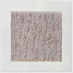
Meg Hitchcock Mantra 01 (Ganesh Mantra) 2019, typed mantra, tea, acrylic paint, 29” x 29”.
This subtle modulation of color also has an emotional element, as in Hitchcock’s word painting, Nocturne. Though Nocturne is essentially monochrome, created in subtle shades of ultramarine blue, it makes a bold statement a la the color field paintings of Mark Rothko, hearkening back to Hitchcock’s early roots in painting abstraction. Though she denies being influenced by any musical arrangement or theory there is nonetheless, a feeling of acoustic resonance in this work—a sort of tranquil hush achieved through repetition and spatial stanzas that only break rhythm in gradual transitions, creating a variation on a theme without jarring the viewer out of their silent reverie. This sensation is compounded by the knowledge that “nocturne” refers to a 19th century compositional style for piano, intended to evoke the night. I can almost hear strains of Chopin filtering through the work as I softly mutter in my inner voice, “noct, noct, noct, nocturne…,” with my head cocked sideways to read the text.
Meg Hitchcock Mantra 01 (Ganesh Mantra) (detail) 2019, typed mantra, tea, acrylic paint, 29” x 29”.
The spacing and layering of the words also supply non-syllabic divisions in the words themselves. In Catherdral they act as a physical disrupter that forces the viewer to consider the word as a separate entity. These breaks also allow for multiple non-relational signifiers to arise. Observing Cathedral, you are initially aware of the word “cat” as the lower half of the word appears in shadow. Knowing Hitchcock’s awareness of religious context I can only think this as another deliberate move to undermine institutional prejudices, recalling that in 1484, Pope Innocent VIII declared that, “the cat was the devil’s favourite animal and idol of all witches.”
Meg Hitchcock Mantra 02, (Crown Mantra) 2019, typed mantra, tea, acrylic paint, 30″ x 23″.
Manually typed in 12 pt. Courier script (designed by Howard Kettler, 1955), these newer works portray a self effacing workman-like quality that is the exact opposite of what she terms the “extravagance” of the Catholic church. Kettler’s naming of this typeface stemmed from his philosophy that, “a letter can be just an ordinary messenger, or it can be the courier, which radiates dignity, prestige and stability.” By using this utilitarian script in such a reverential format, she is elevating the workaday world to iconic status, not unlike the large-scale compositions by 19th Century French Realists such as Jean-François Millet and Gustave Courbet, of peasants and blue-collar workers.
Meg Hitchcock Hortus Deliciarum (small version) 2019, typed words, acrylic paint, 14 x 11”.
Hitchcock emphasizes the material reality of the word while exalting its existence as a signifier of both the thing it represents (whether it be a cathedral, a nocturne or a spiritual mantra) and that which she manipulates it to represent, accentuating its iconic status to a level of almost religious idolatry. The Noigandres 4 poets of the 1950’s termed it best in their Plano Piloto para a Poesia Concreta (Pilot Plan for the Concrete Poetry) (1958) as “verbovocovisual”, a vehicle of “sound, visual form, semantical charge.” It becomes a thing in and of itself, to be considered from both concrete and metaphysical points of view, rising beyond simplistic terms of interpretation and surpassing the norms of communication, to be accepted as a vibrational source of knowledge which we may term logos, or better yet, the breath of sound.
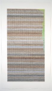
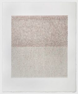
Meg Hitchcock Than 2018, typed words, acrylic paint, 22.5” x 16”.
French philosopher Jacques Derrida in his seminal book on semiotics, Of Grammatology (1974) stated that “language itself is menaced in its very life, helpless, adrift in the thread of limitlessness, brought back to its own finitude at the very moment when its limits seem to disappear, when it ceases to be self-assured, contained, and guaranteed by the infinite signified which seemed to exceed it.” He called for finding a “new situation for speech.” In subordinating the written word for the iconic symbol (a smiley face for happy, a frown for sad or a wink to imply a private joke) we have reduced language to the most simplistic of terms, losing important layers of meaning. While this may be the evolution of language in our fast paced, technologically enhanced reality, I look to artists like Hitchcock as a lifeline to what is sacred in the world of communication, the word, with all its nuances and possible interpretations. Congruently, Hitchcock is also acutely aware of the representation of words as a powerful tool for change and influence given their use and misuse by political and religious factions over the centuries. She shares this affinity with Derrida as well, using the word as a tool for the deconstruction of these institutions, for, inasmuch as she dissects the structure of language, Hitchcock carries a poignant awareness that, as Derrida famously stated, “Il n’y a pas de hors-texte” (“There is no outside of text.”)
Meg Hitchcock The Secret of the Golden Flower 2018, letters cut from my Aunt Helen’s Bible, thorns, 15.25” x 15.25”.
Kim Power is a mixed-media painter. She has exhibited since 2002 in solo and group shows throughout the U.S., France and The Netherlands. A graduate of the New York Academy of Art (2014), Power has written for The Brooklyn Rail, ARTPULSE magazine, Art Aesthetics magazine, and the blogs ArteFuse and Quantum Art Review and has co-curated a number of successful exhibitions, including Natural Proclivities, Shirley Fiterman Art Center, Borough of Manhattan Community College and Representing: Selected Works from Alumni and Faculty of the New York Academy of Art at Artisan Lofts, NYC.
5 Comments
Miriam Basart says
July 17, 2019 at 9:16 pm
This work shows the depth of intellectual research in her art, as a fellow atheist, I congratulate you.
Maureen L says
July 18, 2019 at 12:23 pm
Superb writing and analysis of Meg Hitchcock's work that richly deserves a fuller understanding of its genesis and place in the histories of religious constructions and beliefs as much as art. Thank you for this.
Daphne A Deeds says
July 18, 2019 at 6:09 pm
Wonderful work. Excellent essay. Congratulations to both the artist and the author.
Morna Crites-Moore says
July 30, 2019 at 12:40 pm
Stunning! Thank you for showcasing Meg Hitchcock’s work.
Christine Aaron says
August 7, 2019 at 5:03 pm
Kudos Kim Power for an insightful and incisive essay on Meg Hitchcock's work. I am a fan of Meg's work, and continue to be intrigued as her work develops and changes. Your essay brought even more to bear on her work, and offered much to think about. Thank you!
Related Blog Articles
No related blog articles yet.